
How do tradies choose the right colours and fonts for their branding?
- TimButton
How do tradies choose the right colours and fonts for their branding?
How do tradies choose the right colours and fonts for their branding? This critical decision can make or break your business image. At Tradie Up, we understand the impact of colours and fonts on branding. Let’s dive into some key considerations.
Importance of Colour Psychology
Colour psychology plays a major role in attracting the right audience. Blue often signifies trust, while red evokes passion. Consider your target demographic and the emotions you want your brand to convey.
Choosing Colours that Resonate
Tradies should select colours that resonate with their industry and clientele. Earth tones might appeal to landscapers, while vibrant hues suit creative trades. This ensures your brand stands out while aligning with customer expectations.
Balancing Contrast and Readability
Contrast and readability are crucial for effective branding. High contrast improves visibility, especially in logos and signage. Ensure text and background colours complement each other for easy reading.
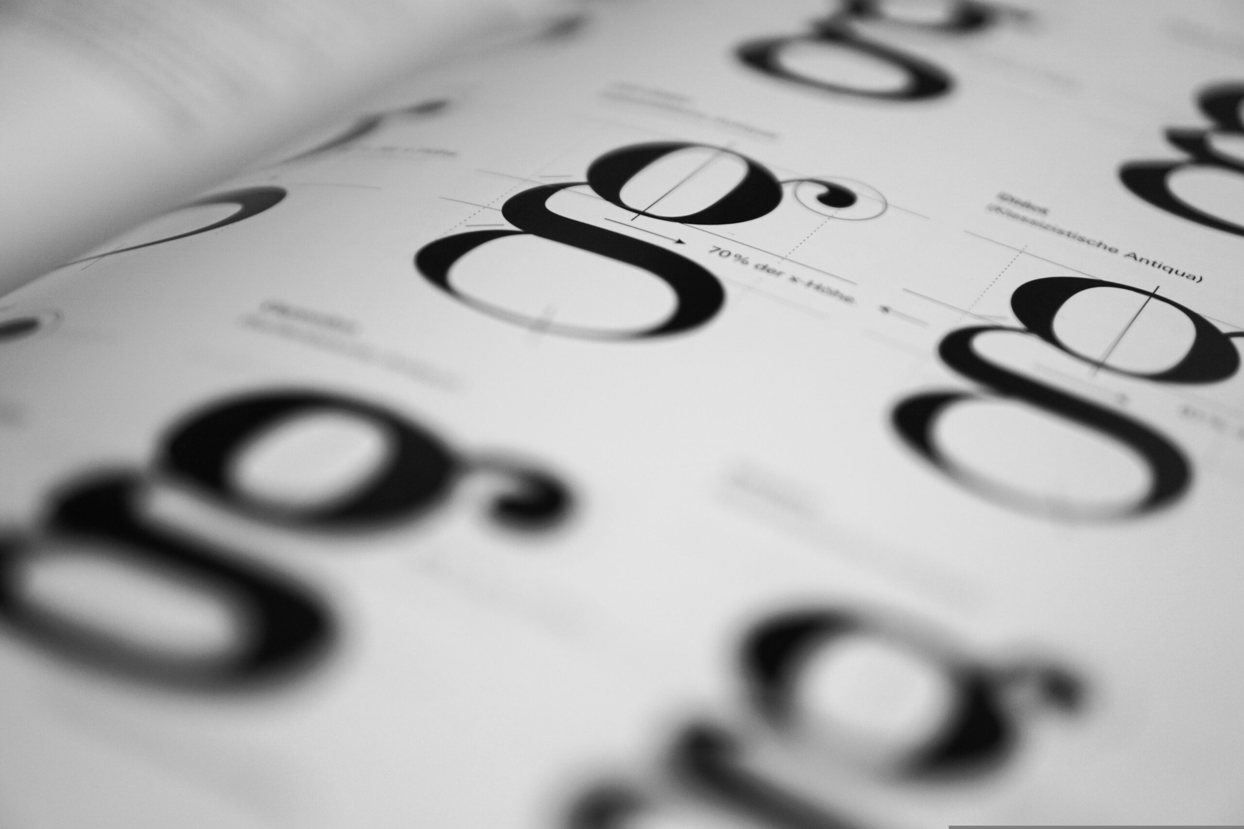
Serif vs Sans Serif Fonts
For tradies, choosing between serif and sans serif fonts can affect the brand image. Serif fonts are traditional and reliable, while sans serif fonts offer a modern, clean look. Consider your brand’s personality when making this choice.
Colours for Trust and Reliability
Trust and reliability are key in trade services. Blue and green are popular choices that communicate these values effectively. These colours can help attract clients seeking dependable services.
Fonts for Modern Designs
Modern fonts can help your brand appear up-to-date and innovative. Sans serif fonts like Arial or Helvetica give a contemporary feel, fitting for trades wanting a fresh image. Choose fonts that align with your brand’s vision.
At Tradie Up, we help tradies craft a compelling brand identity. Discover how we can help you today!
Learn more by booking a free consultation.
Importance of colour psychology
Colour psychology can significantly impact a business’s success, especially for trade professionals in Australia. Tradie Up, a platform supporting tradespeople, can harness the power of colour to attract clients and build a strong brand identity. Understanding the psychological effects of colours can help Tradie Up make strategic choices that resonate with their target audience.
Building Trust and Reliability
In the trades industry, trust is crucial. Colours like blue and green are often associated with trustworthiness and reliability. Incorporating these colours into Tradie Up’s branding can reassure potential clients that they are dealing with dependable professionals. Subtle touches of these hues in logos or promotional materials can create a lasting impression.
Encouraging Action
Colours like red and orange can inspire action and urgency. For Tradie Up, using these colours in call-to-action buttons on the website or in promotional campaigns can encourage potential clients to reach out or book a service. While bold, these colours should be used sparingly to maintain a balanced and professional appearance.
Differentiating the Brand
With many tradespeople competing for attention, Tradie Up can use unique colour combinations to stand out in a crowded market. A distinctive colour palette can make the brand more memorable and easily identifiable. This helps create a visual identity that sticks in the minds of potential clients, setting Tradie Up apart from competitors.
Choosing colours that resonate
Choosing the right colours for your brand is crucial, especially for Tradie Up in Australia. The hues you select can impact how your business is perceived and can attract or repel potential customers. In a competitive industry, ensuring that your colours resonate with your target audience is key to establishing a strong brand presence.
Understanding Cultural Significance
In Australia, colours carry specific cultural meanings that can influence consumer behaviour. For instance, green often symbolises growth and sustainability, making it a popular choice for environmentally conscious businesses. Blue is another commonly chosen colour, representing trust and reliability. It’s essential to research and understand these cultural significances to ensure your colour choice aligns with the values you want to project.
Reflecting Your Industry
The trades industry has a unique set of expectations when it comes to branding. Bold and vibrant colours like orange and yellow can convey energy and action, while earthy tones such as brown or grey might suggest stability and dependability. Consider what message your business needs to send and select colours that reflect these industry traits.
Creating Emotional Connections
Colours can evoke emotions and influence decisions. Warm tones like red and orange can create excitement and urgency, while cool tones like blue and green can calm and reassure. Understanding the emotional impact of colours can help you create a brand that resonates deeply with your clients, encouraging loyalty and trust.
Balancing contrast and readability
Choosing the right colours and fonts for branding is crucial for tradies in Australia. It’s not just about looking good; it’s about ensuring your message is clear and easy to read. Balancing contrast and readability can make or break your brand’s visual appeal and communication effectiveness.
Understanding Contrast
Contrast is key in making text legible and visually appealing. For tradies, this means selecting colours that stand out against each other. A high contrast between background and text ensures that your business name and tagline pop. This is especially important in outdoor signage and vehicles where lighting can vary. Opt for classic combinations like dark text on a light background or vice versa for maximum impact.
Readability Matters
Font choice dramatically affects readability. Tradies should aim for clean, simple fonts that can be read quickly. Avoid overly decorative typefaces that may look stylish but can hinder clarity. Keep font sizes appropriate to ensure visibility from a distance, particularly on business cards, uniforms, and vehicles. Consistency across all branding materials reinforces brand recognition.
Testing Across Mediums
Once you’ve chosen your colours and fonts, test them in various formats and lighting conditions. What looks good on a computer screen might not translate well to print or fabric. Consider how your branding will appear on digital platforms, print materials, and physical items like uniforms. Gathering feedback from clients or colleagues can provide valuable insights into what works best.
Serif vs sans serif fonts
Choosing the right font is crucial for tradies who want to make a lasting impression with their branding. The debate between serif and sans serif fonts often leaves many scratching their heads. Each style has its own set of characteristics and can elicit different responses from potential clients. For tradies looking to establish a professional yet approachable image, understanding these differences is key.
Serif Fonts: Traditional and Trustworthy
Serif fonts are known for their small lines or strokes attached to the end of larger strokes in a letter. This style exudes a sense of tradition and reliability, making it a popular choice for businesses wanting to convey trust. For tradies in Australia, serif fonts might be ideal if you’re looking to attract customers who value a classic and established brand image. Think of them as the safe choice for those working in more traditional trades.
Sans Serif Fonts: Modern and Clean
Sans serif fonts, on the other hand, do away with the additional strokes, resulting in a cleaner and more modern look. This style is often seen as more contemporary and approachable, making it a great option for tradies aiming to appear fresh and innovative. If your trade involves cutting-edge technology or modern design, sans serif fonts can help communicate that forward-thinking ethos.
Choosing the Right Style for Your Brand
Ultimately, the choice between serif and sans serif fonts should align with the nature of your trade and the message you want to convey. Consider your target audience and the values you wish to project. Whether you prefer the classic appeal of serifs or the sleekness of sans serifs, your font choice will play a pivotal role in shaping your brand’s identity in the competitive Australian market.
Colours for trust and reliability
Choosing the right colours for a tradie’s branding can significantly impact how potential clients perceive their business. In the competitive world of trades, where trust and reliability are paramount, the right colour palette can make all the difference. Colours convey emotions and messages, and understanding their psychological effects can help tradies build a brand that inspires confidence.
Blue: The Colour of Trust
Blue is often associated with trust, dependability, and professionalism. Many tradies opt for blue in their branding to communicate these qualities to their clients. It’s a calming colour that can make clients feel at ease, suggesting that a tradie is reliable and capable of delivering quality work. From navy to sky blue, different shades can suit various brand identities while maintaining the core message of trustworthiness.
Green: Symbolising Reliability and Growth
Green is another popular choice, symbolising reliability, growth, and balance. It’s particularly effective for tradies in fields like landscaping or construction, where growth and sustainability are key themes. Green suggests a connection with nature and can give clients the impression that a tradie is steady and committed to long-term results. This colour can enhance a brand’s reputation for sustainability and reliability.
Grey: The Neutral Ground
Grey, while neutral, offers a backdrop of sophistication and practicality. It conveys a sense of balance and neutrality, suggesting that a tradie’s services are solid and dependable. Grey can be used as a primary or secondary colour, helping to highlight other colours while maintaining an overall sense of reliability. It’s an understated choice that can appeal to clients looking for a no-nonsense, professional approach.
Fonts for modern designs
Choosing the right font for tradie branding in Australia is crucial for creating a professional and relatable image. Modern design trends have evolved, allowing tradies to showcase their unique identity through typography. With the right font, a tradie can communicate reliability, professionalism, and approachability, resonating well with their target audience. Let’s explore some key considerations when selecting fonts for modern designs in the tradie industry.
Understanding Font Personality
Fonts have personalities that can significantly impact how a brand is perceived. For tradies, it’s essential to select fonts that match the business ethos. Serif fonts often convey tradition and reliability, making them suitable for established tradies. Sans-serif fonts, on the other hand, offer a modern and clean look, ideal for those wanting a contemporary image. Script fonts can add a touch of elegance but should be used sparingly to maintain readability.
Readability is Key
When choosing fonts, readability should be a top priority. Tradies often work on signage, business cards, and online platforms, where clear communication is crucial. Fonts like Arial, Helvetica, or Roboto provide excellent readability across different mediums. It’s important to test how a font appears in various sizes and formats to ensure clarity and legibility in all branding materials.
Consistency Across Platforms
Maintaining consistency in font use across all branding platforms helps build recognition and trust. Whether it’s a website, social media, or vehicle signage, using the same fonts ensures a cohesive brand identity. This consistency helps customers easily recognise the tradie’s business, making it memorable and professional.
Matching colours to industry
Choosing the right colours for your tradie business is more than just picking what looks good. It’s about aligning with your industry and the message you want to convey. In Australia, where the market is competitive, having the right colour scheme can make a significant impact on how your brand is perceived. Let’s dive into how different industries can influence colour choices for tradies.
Construction Industry
In the construction industry, earthy tones like browns and greens can represent reliability and strength. These colours are often used to convey a sense of durability and trustworthiness. Blue is another popular choice, symbolising safety and professionalism. It’s essential to choose colours that not only stand out on-site but also resonate with safety and environmental sustainability, key concerns in the construction sector.
Electrical and Plumbing Services
For electricians and plumbers, colours like blue and orange are common. Blue often represents trust and reliability, which are crucial for services where safety is a priority. Orange, on the other hand, signifies creativity and energy, making it ideal for showing innovation and quick service. These colours help in building confidence among clients that their electrical or plumbing issues will be handled efficiently.
Landscaping and Gardening
In landscaping and gardening, greens and browns are go-to choices as they naturally connect with the earth. Green is synonymous with growth and vitality, perfect for businesses focused on creating lush, vibrant outdoor spaces. Browns can add a touch of stability and resilience, reassuring clients of a professional touch in maintaining their gardens and landscapes.
Accessibility considerations
When tradies in Australia are thinking about their branding, accessibility is a critical consideration. Ensuring that all potential customers, including those with disabilities, can easily interact with your brand is not just a legal requirement but also a business advantage. Accessibility can significantly influence how people perceive and engage with your business.
Colour Contrast for Readability
Choosing the right colours is more than just aesthetics. It’s crucial to ensure that text is readable against any background colour. High contrast between text and background can make reading easier for everyone, especially those with visual impairments. Tools like the Web Content Accessibility Guidelines (WCAG) can help in assessing your colour choices to ensure they meet accessibility standards.
Font Selection for Clarity
Fonts should be easy to read and not overly stylised. Sans-serif fonts are generally recommended as they are clearer on digital screens. Additionally, consider the size of your fonts. Larger text improves readability for people with vision difficulties. Consistent use of fonts across all branding materials also enhances accessibility and brand recognition.
Inclusive Design Practices
Incorporating inclusive design practices means thinking about how different people will interact with your branding. This includes ensuring website navigation is keyboard-friendly and providing alternative text for images. By prioritising these considerations, tradies can create a more inclusive brand that welcomes all customers, ultimately broadening their market reach.
Tools for creating colour schemes
Choosing the right colour scheme is crucial for tradies looking to establish a strong brand identity. In Australia, several tools can help you create cohesive and impactful colour schemes, perfect for setting your business apart.
Colour Hunt
Colour Hunt is a popular tool that provides a vast collection of colour palettes curated by designers worldwide. It’s user-friendly and offers inspiration for various moods and styles. With Colour Hunt, tradies can easily browse through trending palettes or search by specific colour preferences, making it a great starting point for those unsure about their branding direction.
Coolors
Coolors is another excellent resource for creating custom colour schemes. This tool allows you to generate palettes quickly by tapping the spacebar, offering endless combinations. You can lock in certain colours you like and let the tool suggest complementary shades. It’s perfect for tradies who want to experiment with different looks before settling on a final scheme.
Adobe colour
Adobe colour is a comprehensive tool that offers advanced features for those wanting more control over their colour choices. Tradies can create palettes based on colour rules or extract themes from images, which is helpful if you have an inspiration photo. Adobe colour also integrates well with Adobe’s suite of design tools, making it a favoured choice for those already using their software.
Real-world examples
In the competitive world of trades, branding plays a crucial role in capturing attention and building customer trust. Tradie Up in Australia provides an excellent example of how thoughtful colour and font choices can significantly impact a brand’s success. By examining real-world examples, we can better understand how tradies can effectively utilise these elements to enhance their branding.
The Power of Bold Colours
Tradie Up leverages bold colours to create a striking visual identity. Many tradies opt for vibrant hues like blues and greens, which convey reliability and professionalism. For instance, a plumbing business might use a deep blue to represent water, instilling a sense of trust and expertise. These colour choices help tradies stand out in a crowded market and make a memorable impression on potential clients.
Strategic Font Choices
Fonts also play a critical role in tradie branding. Tradie Up suggests using clean, modern fonts that are easy to read both online and offline. A construction company, for example, might choose a bold sans-serif font to convey strength and precision. Consistency in font usage across all marketing materials ensures brand recognition, reinforcing the company’s image as reliable and professional.
The Role of Consistency
Consistency in colour and font choices is key to successful branding. Tradie Up advises tradies to maintain uniformity across all platforms, from business cards to websites. This creates a cohesive brand image that customers can easily recognise and trust. By aligning their visual identity with their values and services, tradies can effectively communicate their brand message and attract a loyal customer base.
Trends in branding colours
In the world of tradies, branding is not just about a logo; it’s about making a statement. The right choice of colours can convey professionalism, reliability, and expertise. In Australia, branding colours for tradies are evolving, reflecting both market trends and cultural influences. Understanding these trends can help tradies make informed decisions that resonate with their target audience.
Earthy Tones for Authenticity
Earthy tones like deep greens, browns, and muted yellows are gaining traction among tradies looking to convey authenticity and a connection to the land. These colours suggest a grounded and trustworthy service, appealing to clients who value sustainability and reliability. They also evoke a sense of calmness and stability, which are desirable traits in a tradie.
Bold and Bright for Visibility
On the flip side, some tradies are opting for bold and bright colours such as electric blues, vibrant reds, and neon accents. These choices are perfect for those wanting to stand out in a competitive market. Bright colours are eye-catching and can make a powerful first impression, ensuring that a business remains top of mind for potential clients.
Monochrome for Modernity
Monochrome palettes are becoming popular among tradies aiming for a sleek and modern look. Black, white, and grey tones can create a sophisticated and stylish brand image. This trend is particularly appealing to tradies targeting an urban clientele or high-end projects, where a clean and professional appearance is crucial.
Avoiding conflicting elements
Choosing the right colours and fonts for tradie branding is more than just picking what looks good. One key aspect is avoiding conflicting elements that can confuse or deter potential clients. The goal is to create a cohesive and professional image that resonates with customers across Australia.
Understanding Colour Psychology
Colours evoke emotions and perceptions, so it’s crucial to select colours that align with the values and services of your tradie business. For instance, blue often conveys trust and reliability, while green can suggest sustainability and growth. Avoid using too many contrasting colours which can create a chaotic appearance and dilute your brand message. A simple, consistent colour palette will help in establishing your brand identity effectively.
Font Selection Matters
Just like colours, fonts also play a significant role in how your brand is perceived. Opt for fonts that are easy to read and reflect the tone of your business. Mixing too many font styles can lead to a disjointed look, so aim for consistency. Generally, one or two fonts are enough to create a clean and professional aesthetic. This ensures that your audience can easily read and interact with your branding materials.
Balancing Visual Elements
Incorporating images, icons, and logos should be done thoughtfully. Make sure these elements complement your chosen colours and fonts. Clashing visuals can confuse the viewer and weaken brand recognition. Keep the design simple and ensure every element serves a purpose. By maintaining a visual balance, you create a more appealing and memorable brand presence, which is crucial in the competitive tradie market.
Importance of branding research
For tradies in Australia, branding research plays a crucial role in crafting a strong and memorable brand identity. It’s not just about picking colours and fonts; it’s about understanding what resonates with your target audience and how your brand can stand out in a competitive market. Comprehensive branding research provides insights that guide these decisions, ensuring that the final brand elements align with the values and preferences of potential customers.
Understanding Audience Preferences
Branding research helps tradies gain a deep understanding of their audience’s preferences, which is vital in selecting the right colours and fonts. Knowing what appeals to your customers can influence their perception of your business. For example, certain colours might evoke feelings of trust or reliability, while specific fonts can convey professionalism or friendliness. By aligning your choices with audience expectations, you create a more relatable and compelling brand identity.
Staying Ahead of Competitors
In the competitive landscape of Australian trades, standing out is essential. Branding research allows tradies to analyse competitor brands and identify opportunities to differentiate themselves. By understanding what works and what doesn’t in your industry, you can make informed decisions about your visual elements. This strategic approach ensures that your branding not only attracts attention but also effectively communicates your unique value proposition.
Adapting to Market Trends
The market is constantly evolving, and so are consumer tastes. Conducting regular branding research keeps tradies informed about the latest trends in design and consumer behaviour. This knowledge helps in updating branding elements to remain relevant and appealing. By staying attuned to market shifts, tradies can ensure their branding efforts continue to engage and attract their target audience effectively.
DIY colour and font tools
Choosing the right colours and fonts is crucial for tradies looking to make a strong impression with their branding. In Australia, the trend towards DIY marketing has seen many tradies exploring online tools to create their unique visual identity. These tools can help simplify the process, making it easy to experiment with different styles without needing a professional designer.
Colour Selection Tools
Colour selection tools are a game-changer for tradies eager to reflect their personality and business ethos. Websites like Canva and Coolors offer easy-to-use platforms where you can mix and match colours to find the perfect palette. These tools often feature pre-made templates and colour schemes tailored to various industries, ensuring that your branding resonates with potential clients. They also allow you to test how colours look together, ensuring a harmonious and professional appearance.
Font Pairing Platforms
Fonts play a significant role in defining your brand’s voice. Platforms like Google Fonts and FontPair provide a vast array of fonts that can be mixed and matched to create the perfect look. These tools often suggest pairings that work well together, saving you the hassle of trial and error. For tradies, selecting fonts that are easy to read and reflect the nature of your work can enhance brand recall and customer trust.
Integration and Testing
Once you’ve chosen your colours and fonts, it’s essential to see how they work in real-world applications. Tools like Adobe Spark allow tradies to create mock-ups of business cards, flyers, and social media posts. This step is crucial to ensure that your chosen elements maintain their impact across different mediums. Testing your designs helps in refining and finalising your brand identity before launching it to your audience.
Case studies in effective branding
When tradies in Australia embark on their branding journey, choosing the right colours and fonts is crucial. Effective case studies can provide valuable insights into how these elements come together to create a memorable brand identity. Tradie Up, a well-respected name in the industry, has some fascinating examples that highlight the power of strategic branding choices.
Understanding Target Audience
Tradie Up discovered that understanding the target audience is key to selecting appropriate branding elements. By conducting thorough market research, they identified what their clients valued most: reliability, quality, and expertise. This understanding guided their choice of colours, opting for bold, trustworthy blues and greens that resonate with customers seeking dependable services.
Consistency Across Platforms
A consistent brand image across all platforms is essential for recognition and trust. Tradie Up employed a cohesive approach in their branding by using the same fonts and colour schemes on everything from their website to their business cards. This uniformity not only made their brand easily recognisable but also reinforced their professional image.
Adapting to Trends
While consistency is vital, staying relevant means being aware of changing trends. Tradie Up successfully refreshed their branding by subtly updating fonts to more modern styles while maintaining their core colour palette. This approach kept their brand current without losing the essence that clients had come to trust.
Calling All Tradies... When you know, you know!

Discover How To:
- Identify your key marketing numbers
- Using marketing tools to work smarter
- How to choose the right marketing
MORE LEADS. LESS HASSLE.
Enquire about Why is professional branding essential for tradie businesses?
If you’re looking for Results Driven Tradie Lead Generation For Your Tradie Business please call Adam on.0452 692 335.
Please leave your details in the form and we will call you back the same day.
So that we can process your enquiry efficiently, please leave as many details as possible.
The Tradie Up Team
Please leave your details in the form and we will call you back the same day.
So that we can process your enquiry efficiently, please leave as many details as possible.
The Tradie Up Team
Share the Post: