
How can tradies optimise their website for mobile users?
- TimButton
How can tradies optimise their website for mobile users?
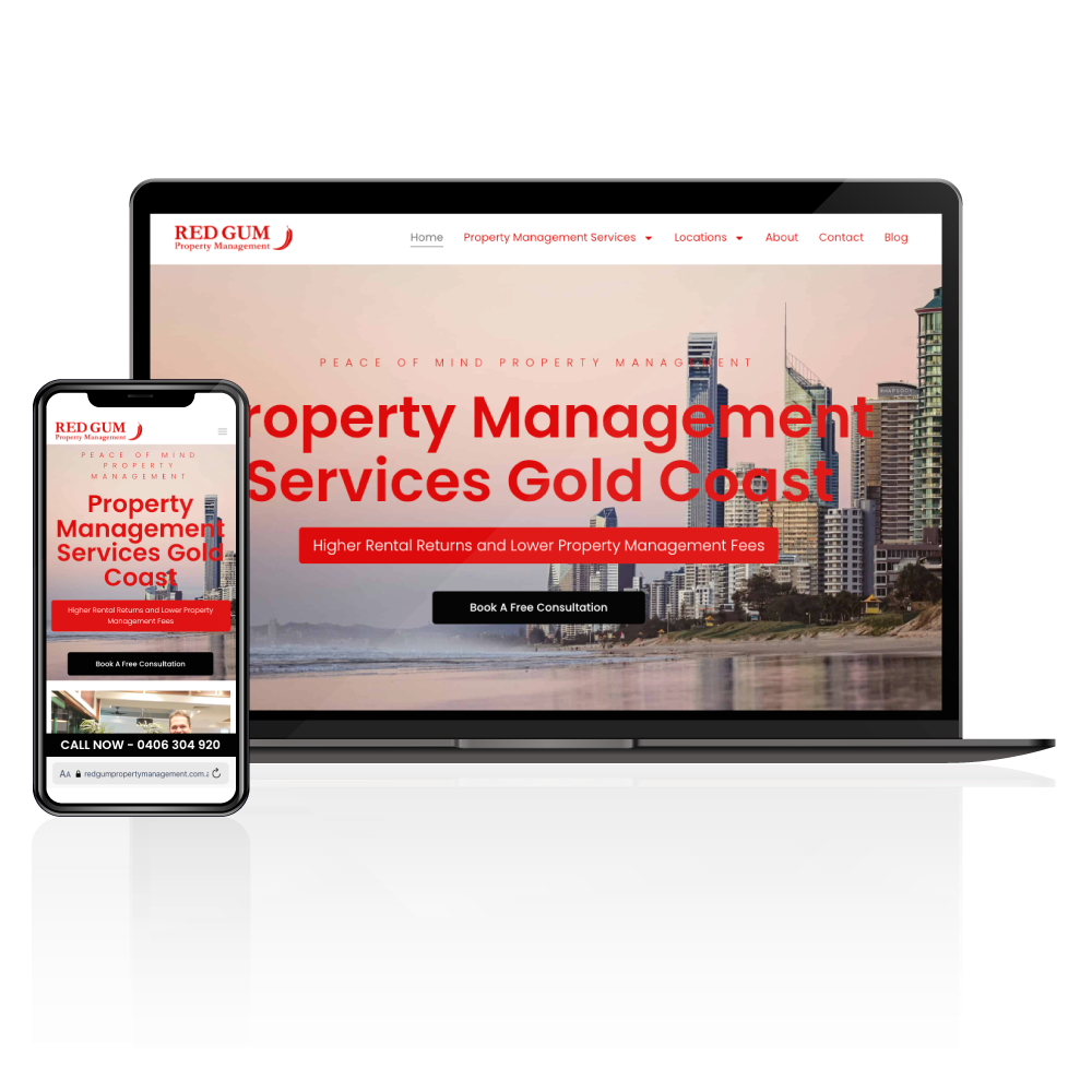
How can tradies optimise their website for mobile users? Tradies often overlook mobile optimisation. But it’s crucial for attracting leads. Tradie Up can guide you through this process. Mobile-friendly sites help with high ranking and generating leads. Let’s dive into some practical tips.
What is Mobile Optimisation?
Mobile optimisation ensures your site works well on smartphones. It’s about adapting your site to be user-friendly on smaller screens. It includes fast load times, clear navigation, and readable text. Mobile-friendly sites attract more visitors and can boost your search ranking.
Importance of Responsive Design
A responsive design automatically adjusts to different screen sizes. It ensures your site looks great on any device. This is crucial for keeping visitors engaged. Responsive design can improve user experience and reduce bounce rates, helping you convert more visitors into customers.
Ensuring Fast Load Times
Fast load times are essential for mobile users. Slow websites can frustrate visitors and lead to higher bounce rates. To speed up your site, compress images and use efficient coding practices. A fast website provides a seamless experience, encouraging users to stay longer.
Testing Website in Devices
Regular testing on various devices ensures consistency. Check your site on different phones and tablets. Testing helps identify any display issues or slow-loading elements. By doing this, you can fix problems before they affect your visitors’ experience.
Avoiding Excessive Pop-ups
Excessive pop-ups can irritate mobile users. They often block content and disrupt navigation. Use pop-ups sparingly and ensure they are easy to close. This makes your site less intrusive and more enjoyable, helping you retain visitors.
Simplifying Navigation
Simplify navigation with clear menus and easy-to-find links. Mobile users need to find information quickly. A straightforward navigation system helps them do just that. Simplified navigation can enhance user experience, making it more likely for visitors to contact you or make a booking.
Tradie Up can assist in optimising your site for mobile users. Discover how we can help you today! Learn more by booking a free consultation.
What is mobile optimisation?
Mobile optimisation is all about making sure your website looks and works great on mobile devices. For tradies in Australia, this means your site should be easy to use on a smartphone or tablet, which is where most people browse these days. With more customers searching for services on their mobiles, having a mobile-friendly site can significantly impact how easily potential clients find and interact with your business.
Why Mobile Optimisation Matters for Tradies
In the competitive world of trades, first impressions count. If a potential client visits your site and it’s hard to navigate on their phone, they might quickly move on to a competitor. Mobile optimisation ensures your site loads quickly, displays correctly, and offers a seamless user experience, which can help keep visitors on your page longer and increase conversions.
Key Elements of Mobile Optimisation
There are several crucial elements to focus on for mobile optimisation. Responsive design is a must, allowing your site to adjust automatically to different screen sizes. Fast loading times are also essential; slow pages often lead to higher bounce rates. Make sure your content is readable without zooming, and buttons are large enough to tap easily. These elements help create a user-friendly experience.
Benefits of Mobile Optimisation for SEO
Google favours mobile-friendly sites in search rankings, so optimising your site can improve its visibility. A higher ranking means more potential clients can find your business when searching for services. Furthermore, a well-optimised site can lead to better user engagement and lower bounce rates, which are positive signals to search engines.
Importance of responsive design
In today’s digital age, the importance of responsive design for Tradie Up in Australia cannot be overstated. With more people relying on mobile devices to find and hire tradies, ensuring that your website looks great on smartphones and tablets is crucial. A responsive design not only enhances user experience but also boosts your site’s visibility on search engines, making it easier for potential clients to find your services.
Enhanced User Experience
Responsive design ensures that your website delivers a seamless experience across all devices. For tradies, this means potential clients can easily navigate your services, view galleries, and contact you without frustrating pinch-and-zoom interactions. A smooth user experience can lead to increased engagement and higher conversion rates, as visitors are more likely to reach out when they find the information they need effortlessly.
Improved SEO Performance
Search engines like Google favour mobile-friendly websites. A responsive design is a key factor in improving your SEO rankings, helping Tradie Up stand out in a competitive market. With better search visibility, tradies can attract more traffic to their site, ultimately leading to more job leads and business growth.
Cost-Effective Solution
Maintaining a single responsive website is more cost-effective than managing separate sites for desktops and mobiles. For Tradie Up, this means lower maintenance costs and a consistent brand image across all platforms. Investing in responsive design helps tradies stay ahead of the curve and ensures their online presence is always optimally presented to potential clients.
Ensuring fast load times
In the digital age, ensuring fast load times is crucial for tradies looking to optimise their website for mobile users. A slow website can lead to lost customers, especially when many users access the internet on-the-go. Here’s how you can enhance your website’s speed and performance, making it more appealing to potential clients in Australia.
Optimise Images for Quicker Loading
Images are often the biggest culprits of slow load times. By compressing images without compromising quality, you can significantly reduce loading times. Tools like TinyPNG or image compression plugins for WordPress can help. Ensure all images are in the appropriate format, such as JPEG for photos and PNG for graphics with fewer colours.
Leverage Browser Caching
Browser caching involves storing certain elements of your website in a visitor’s browser memory. By doing this, repeat visitors experience faster load times as their browser doesn’t need to reload the entire site. Implementing caching plugins can automate this process, ensuring your site remains speedy and efficient.
Minimise Redirects
Each redirect on your website adds additional loading time. Reviewing your site’s structure to eliminate unnecessary redirects can improve speed. Aim for a clean, direct path for users to follow, ensuring their experience is seamless and quick.
By focusing on these strategies, tradies can enhance their mobile website performance, ensuring they capture and retain more clients in the competitive Australian market.
Testing website on devices
In today’s digital landscape, tradies in Australia must ensure their websites are mobile-friendly. With more customers searching for services on their smartphones and tablets, optimising websites for various devices is crucial. Testing your website on different devices is a key step in this optimisation process.
Why Test in Multiple Devices?
Testing your website on multiple devices helps identify any design or functionality issues that might affect user experience. Different devices have varying screen sizes and resolutions, so what looks good on a desktop might not translate well to a smartphone. By ensuring your site works seamlessly across all platforms, you enhance customer satisfaction and reduce bounce rates.
Tools for Device Testing
Several tools can assist in testing your website across different devices. Google’s Mobile-Friendly Test is a great starting point, providing insights into how your site performs on mobile. BrowserStack and Responsinator are also useful for viewing how your site appears on various screen sizes and operating systems. These tools help you pinpoint problems, ensuring your site is accessible and functional for all users.
Addressing Common Issues
Once you’ve identified any issues, focus on fixing them promptly. Common problems include slow loading times, poor navigation, and unresponsive design elements. Make sure your website is fast and easy to navigate, with clear calls to action that are easy to tap on smaller screens. Regular testing and updates will keep your site user-friendly, ultimately driving more business to your doorstep.
Avoiding excessive pop-ups
When optimising a tradie’s website for mobile users, avoiding excessive pop-ups is crucial. Pop-ups can be distracting and frustrating, especially on smaller screens. They can lead to a poor user experience, causing potential customers to leave the site prematurely. For tradies looking to build trust and retain visitors, understanding how to manage pop-ups is essential.
Balance Engagement with User Experience
While pop-ups can be effective for engagement, they must be used sparingly. Overloading pages with pop-ups can disrupt the flow of information, making it difficult for users to find what they need. Instead, focus on creating pop-ups that add value, like exclusive offers or important updates, and ensure they are easy to dismiss.
Optimise Timing and Frequency
Timing is key when it comes to pop-ups. Avoid triggering them immediately upon a user’s arrival. Give visitors time to engage with your content first. Additionally, limit the frequency of pop-ups to prevent annoyance. A strategic approach can help maintain a positive impression of your business.
Ensure Mobile-Friendliness
Pop-ups need to be mobile-friendly, fitting well on smaller screens without covering essential content. Use responsive design techniques to ensure they adapt to various devices. Test their functionality across different mobile platforms to make sure they enhance rather than hinder the user experience.
Simplifying navigation
For tradies looking to optimise their websites for mobile users, simplifying navigation is key. A streamlined and intuitive navigation structure enhances user experience, ensuring potential clients can effortlessly find the information they need. As mobile browsing continues to dominate, tradies must ensure their websites cater to this trend, making navigation more straightforward and user-friendly.
Prioritise Essential Links
When designing a mobile-friendly navigation menu, focus on including only the most essential links. Too many options can overwhelm users, leading to frustration and potential loss of business. Identify the most critical pages, such as services, contact information, and testimonials, and ensure they are easily accessible on the main menu. This approach not only simplifies navigation but also directs users to high-value content quickly.
Utilise Sticky Menus
Implementing sticky menus can significantly enhance the user experience on mobile devices. Sticky menus remain at the top of the screen as users scroll, allowing easy access to navigation options without the need to scroll back to the top. This feature is particularly beneficial for tradies whose clients may need to quickly navigate between different sections of the site while on the go.
Incorporate Clear Call-to-Action Buttons
Clear call-to-action buttons are crucial for guiding users through your website. On mobile, these buttons should be prominent and easy to click. Use contrasting colours and concise text to make them stand out. Whether it is to book a service or request a quote, these buttons should be strategically placed to encourage engagement and drive conversions.
Click-to-call buttons
In the competitive world of Australian tradies, making it easy for potential customers to get in touch is crucial. With more people browsing on mobile devices, integrating click-to-call buttons on your website can significantly boost your business. These buttons offer a seamless way for clients to contact you with just a tap, enhancing user experience and driving more leads.
Why Click-to-Call Matters
Click-to-call buttons streamline the process for mobile users who might be on the go and need quick access to your services. Instead of having to copy and paste numbers or write them down, users can instantly initiate a call, saving time and reducing friction. This convenience can be a deciding factor for customers choosing between you and your competitors.
Designing for Mobile
When designing click-to-call buttons, ensure they are prominently placed and easily noticeable. Use contrasting colours and concise text like “Call Now” to grab attention. The button should be large enough to tap comfortably on a smartphone screen, ensuring accessibility for all users.
Tracking and Optimisation
To maximise the impact of click-to-call buttons, tracking their performance is essential. Use analytics tools to monitor how often they’re used and from which pages. This data can inform adjustments to button placement or design, ensuring they continue to effectively capture leads and drive business growth for your tradie services.
Mobile-friendly contact forms
In today’s digital age, having a mobile-friendly website is crucial, especially for tradies in Australia. One key aspect of this is ensuring that contact forms are optimised for mobile users. A seamless mobile experience can make it easy for potential clients to reach out, boosting your business opportunities.
Keep It Simple
When designing mobile-friendly contact forms, simplicity is key. Avoid overwhelming users with too many fields. Focus on essential information like name, phone number, and a brief message. This approach not only makes the form user-friendly but also increases the likelihood of potential clients completing it.
Responsive Design Matters
A responsive contact form automatically adjusts to different screen sizes, ensuring a smooth experience across devices. This flexibility helps users navigate your form without unnecessary zooming or scrolling, making it more likely they’ll get in touch. Implementing responsive design is a must for any tradie looking to capture leads effectively.
Streamline Submission
Tradies should ensure their contact forms offer a quick and easy submission process. Include clear call-to-action buttons and use auto-fill features where possible to speed up the process. Consider adding a confirmation message so users know their inquiry has been received, enhancing the overall user experience.
Ensuring readable fonts
When tradies want to make a splash online, ensuring their website is mobile-friendly is crucial. One often overlooked element is the readability of fonts, which can significantly impact user experience. Ensuring readable fonts is key for Tradie Up in Australia to engage potential clients effectively.
Selecting the Right Font Size
Font size plays a vital role in readability, especially on mobile screens. A font that’s too small can be frustrating to read, while one that’s too large can look awkward. Aim for a minimum of 16 pixels for body text. This size strikes a balance, making text readable without overwhelming the viewer. Adjust headings and subheadings accordingly to maintain a clear hierarchy.
Choosing Legible Font Styles
While decorative fonts might look appealing, they can compromise readability. Stick to simple, sans-serif fonts like Arial or Helvetica for body text. These fonts are easier on the eyes and more adaptable across various screen sizes. For headings, feel free to experiment with styles, but ensure they remain clear and easy to read.
Maintaining Proper Line Spacing
Line spacing, or leading, affects how easily a visitor can follow along with your text. Tight line spacing can make text appear jumbled, while too much space can disrupt the flow. Aim for a line-height of around 1.5 times the font size. This spacing offers a balanced look that’s easy to follow, enhancing overall readability.
Compressing images for speed
In the competitive world of trades, having a fast and efficient website is essential. Mobile users, in particular, expect quick load times when searching for services on the go. One effective way to enhance website speed is by compressing images. This practice not only improves loading times but also enhances user experience, which is crucial for retaining potential clients.
Understanding Image Compression
Image compression reduces the file size of images without significantly compromising quality. This means faster load times and less data usage for mobile users. For tradies, this is especially important as it allows potential customers to access your services quickly, even with slower mobile internet connections.
Tools for Effective Image Compression
There are several tools available for compressing images efficiently. Online platforms like TinyPNG and JPEGmini can significantly reduce image sizes while maintaining quality. Many content management systems like WordPress also offer plugins that automatically compress images upon upload, simplifying the process for tradies who may not have technical expertise.
Balancing Quality and Speed
While reducing file size is important, maintaining image quality is equally crucial. High-quality images showcase your work effectively, attracting more clients. It’s about finding a balance where images load quickly yet remain visually appealing. Testing different compression levels can help achieve this balance.
Mobile SEO strategies
In today’s digital landscape, mobile SEO is essential for tradies looking to attract more clients in Australia. With most people searching for services on their smartphones, ensuring your website is mobile-friendly is crucial for capturing leads and staying competitive.
Focus in Fast Loading Times
Speed matters when it comes to mobile SEO. Tradie websites must load quickly to keep potential clients engaged. Optimise images by compressing them without losing quality and consider using a content delivery network (CDN) to distribute your content efficiently. Simplifying your website’s design can also help reduce load times, making your site more appealing to both users and search engines.
Responsive Design is Key
A responsive website automatically adjusts to fit any screen size, which is vital for mobile users. This means tradies should ensure their site is easily navigable on smartphones and tablets. A seamless user experience can increase the time visitors spend on your site, improving your search engine rankings. Use mobile-friendly menus and ensure buttons are easy to tap.
Consider Voice Search
Voice search is becoming increasingly popular, so optimising for it can give tradies an edge. Think about how clients might phrase their requests verbally and incorporate natural language and long-tail keywords into your content. This approach can help your business appear in voice search results, capturing more local leads and enhancing your online visibility.
Benefits of mobile-first design
In today’s digital age, tradies in Australia must prioritise mobile-first design to enhance their online presence. With more customers using mobile devices to search for services, optimising for mobile is not just a trend but a necessity. A mobile-first approach ensures tradies can effectively reach and engage their target audience, leading to improved business outcomes.
Enhanced User Experience
A mobile-first design offers a seamless experience for users on smartphones and tablets. This design strategy ensures that the website is easy to navigate, with fast loading times and responsive layouts. For tradies, this means potential clients are less likely to abandon the site, increasing the chances of securing new business.
Improved Search Rankings
Google favours mobile-friendly websites in its search results, making mobile-first design crucial for SEO. By optimising for mobile, tradies can improve their search rankings, making it easier for potential customers to find their services online. Higher visibility in search results can lead to increased traffic and more business opportunities.
Greater Customer Engagement
Mobile-first design encourages user engagement through easy access to contact forms, click-to-call buttons, and other interactive features. For tradies, this means customers can quickly get in touch, request quotes, or book services, streamlining the customer journey and enhancing satisfaction.
Embracing a mobile-first design is vital for tradies looking to stay competitive and connect with more customers in Australia’s digital landscape.
Examples of mobile-friendly websites
In the digital age, having a mobile-friendly website is essential for tradies in Australia. Many successful tradies have embraced mobile optimisation, ensuring their sites are accessible and easy to use on smartphones and tablets. These examples highlight effective strategies that can be adopted to enhance user experience and boost online presence.
Local Plumbing Solutions
Local Plumbing Solutions has a website that loads quickly on mobile devices, ensuring potential customers aren’t kept waiting. The site features a clean layout with easy-to-read text and clear navigation buttons, making it simple for users to find contact information or request a quote. By prioritising speed and user-friendliness, Local Plumbing Solutions effectively retains visitors and encourages engagement.
Eco Electrical Services
Eco Electrical Services offers a great example of mobile-responsive design through its use of large, tappable buttons and streamlined forms. Their site adapts seamlessly to various screen sizes, ensuring users can access essential services without hassle. By optimising for touch interaction, Eco Electrical Services ensures a smooth customer journey, enhancing satisfaction and conversion rates.
Green Earth Landscaping
Green Earth Landscaping excels with its visually appealing mobile site that showcases their portfolio effectively. High-quality images load swiftly without compromising performance, allowing potential clients to view past projects easily. The intuitive design and prominent call-to-action buttons make it easy for users to get in touch or schedule consultations, highlighting the importance of visual content in engaging mobile users.
Tools for testing responsiveness
In today’s digital landscape, ensuring your tradie website is mobile-friendly is crucial. With a growing number of Australians using smartphones to seek services, a responsive website can significantly impact user experience and engagement. For tradies in Australia, having a website that adapts seamlessly to different devices is not just a luxury but a necessity. Luckily, there are several tools available to help test and improve your site’s responsiveness.
Google’s Mobile-Friendly Test
Google’s Mobile-Friendly Test is a simple yet effective tool for checking how easily a visitor can use your page on a mobile device. It provides a straightforward report that highlights any issues affecting usability. For tradies, this tool is invaluable as it offers insights directly from Google, ensuring your site meets the search engine’s standards.
Responsive Design Checker
Responsive Design Checker allows you to view your website on various screen sizes, from smartphones to tablets. This tool helps tradies see how their website looks on multiple devices, ensuring that navigation and content are accessible and aesthetically pleasing across the board.
BrowserStack
BrowserStack offers a more comprehensive testing solution, allowing tradies to test their websites across real devices and browsers. This tool provides a detailed view of how your site performs on different platforms, helping identify specific areas that might need adjustments. It’s particularly useful for tradies who want a thorough understanding of their site’s cross-browser compatibility.
Common mistakes in mobile optimisation
As tradies in Australia increasingly rely on mobile traffic, optimising their websites for mobile users is crucial. However, common mistakes in mobile optimisation can undermine these efforts. Understanding these pitfalls can help tradies enhance their online presence and attract more customers.
Slow Loading Times
One of the most common mistakes is having slow loading times. Mobile users expect fast access to information, and delays can lead to high bounce rates. Tradies should ensure their websites are lightweight by compressing images and optimising scripts to improve speed. A quick-loading site not only satisfies users but also ranks better in search engines.
Unresponsive Design
Another frequent issue is unresponsive design. Websites that don’t adapt to varying screen sizes can frustrate users. Tradies need to implement responsive design principles, ensuring their site looks good and functions well on both smartphones and tablets. This adaptability improves user experience and keeps visitors engaged.
Poor Navigation
Complicated navigation can turn potential customers away. Mobile users prefer intuitive menus and easy-to-find information. Tradies should streamline their site’s navigation to make it user-friendly. A simple, clear structure helps visitors find what they need quickly, increasing the chances of converting them into clients.
Calling All Tradies... When you know, you know!

Discover How To:
- Identify your key marketing numbers
- Using marketing tools to work smarter
- How to choose the right marketing
MORE LEADS. LESS HASSLE.
Enquire about Why do tradies need a professional website to grow their business?
If you’re looking for Results Driven Tradie Lead Generation For Your Tradie Business please call Adam on.0452 692 335.
Please leave your details in the form and we will call you back the same day.
So that we can process your enquiry efficiently, please leave as many details as possible.
The Tradie Up Team
Please leave your details in the form and we will call you back the same day.
So that we can process your enquiry efficiently, please leave as many details as possible.
The Tradie Up Team
Share the Post: